
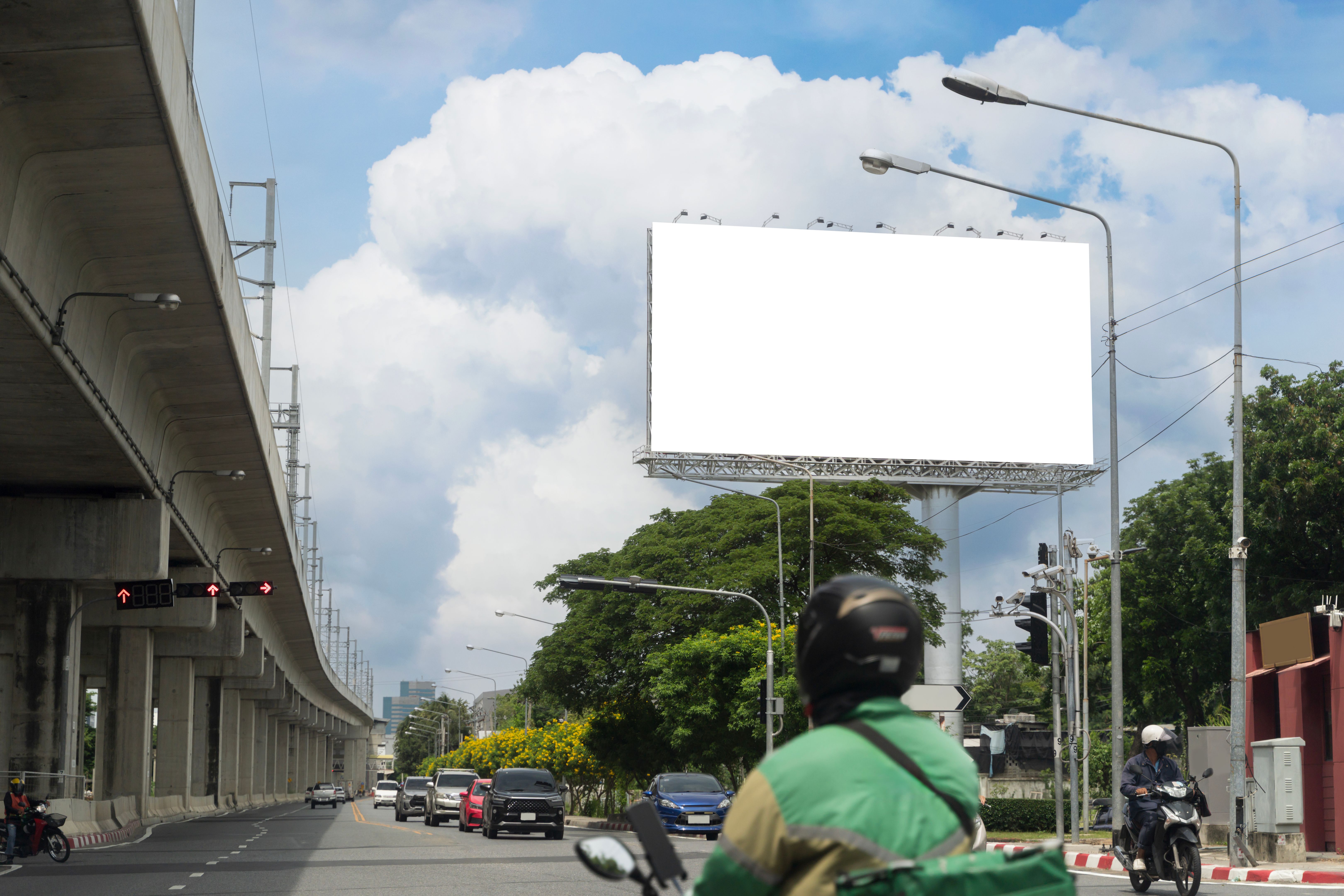
Common Billboard Design Mistakes and How to Avoid Them
Understanding the Purpose of Your Billboard
When designing a billboard, the first step is to clearly understand its purpose. Billboards are typically used to grab attention quickly and convey a message in a matter of seconds. A common mistake is overloading it with information, which can confuse or overwhelm viewers. Focus on delivering a concise and impactful message that aligns with your campaign goals.
Consider your target audience and what action you want them to take. Whether it’s visiting a website, making a phone call, or attending an event, ensure that your message is clear and calls for a specific action. This clarity will help in not only drawing attention but also in achieving the desired results from your billboard campaign.
Prioritizing Readability
One of the most crucial aspects of billboard design is readability. Using fonts that are too small or complex can make your message difficult to read at a glance. Ensure that your text size is large enough to be seen from a distance and choose fonts that are simple and bold. The color contrast between the text and background should also be strong to enhance visibility.
Another key aspect is the amount of text on the billboard. Aim to use no more than seven words to ensure that your message can be read and understood quickly as people drive by. Prioritize essential information such as your brand name, a catchy tagline, or a memorable call-to-action.

Selecting Appropriate Imagery
Images play a significant role in billboard design but choosing the right ones can be challenging. Avoid using images that are too detailed or complex, as they can distract from the main message or be difficult to interpret from a distance. Opt for bold, simple images that complement your text and enhance the overall message.
The imagery should be relevant to your brand and the message you're trying to convey. High-quality images are essential since low-resolution pictures can appear blurry and unprofessional on large billboards. Investing in professional photography or high-quality stock images can make a significant difference.
Avoiding Clutter
Clutter is one of the biggest pitfalls in billboard design. Trying to include too many elements—such as excessive text, multiple images, or unnecessary graphics—can lead to a cluttered and ineffective design. Instead, focus on simplicity and ensure each element serves a purpose.
Use negative space effectively to make important elements stand out. This can help guide the viewer's eye naturally through the design, emphasizing the key message or call-to-action. Remember that less is often more when it comes to effective billboard design.
Testing Your Design
Before finalizing your billboard design, it's crucial to test its effectiveness. One way to do this is by creating a mock-up and viewing it from a distance similar to how it would be seen in real life. This allows you to assess readability, image clarity, and overall impact.
You might also consider gathering feedback from colleagues or conducting a small focus group. This external input can provide valuable insights and highlight any potential issues you might have overlooked.
Conclusion
Designing an effective billboard involves careful consideration of various elements, from clarity of message to visual appeal. By avoiding common mistakes such as overloading information, using unreadable fonts, selecting inappropriate imagery, creating clutter, and neglecting testing, you can create billboards that not only capture attention but also communicate your message powerfully.
Keep these tips in mind and you'll be well on your way to crafting compelling billboards that stand out and resonate with your audience.